 Baseline Report")
A Data Quality (DQ) Baseline Report acts as the “health check” of your data before any remediation begins. In the Orion Enterprise Information Intelligence Graph (EIIG) platform, this isn’t a static document but a dynamic dashboard that uses AI/ML to profile your entire landscape in real time.
Here is what a comprehensive DQ baseline report looks like, structured by the standard DAMA dimensions and Orion-specific features:
1. Executive Summary (The Health Score)
A high-level “RAG” (Red-Amber-Green) status that gives executives an immediate view of data trustworthiness.
- Global Quality Score: An aggregated percentage representing the overall health of the platform.
- Critical Alerts: High-priority “out-of-policy” activities or critical failures in key business assets.
2. DAMA Dimension Breakdown
The report scores each data asset across the core pillars of data quality:
| Dimension | Core Question Asked | Example Metric |
|---|---|---|
| Completeness | Is all the necessary data present? | Percentage of null or missing values in critical fields. |
| Accuracy | Does the data reflect the real-world scenario? | Pass rate against a known correct reference source. |
| Consistency | Does data match across different systems? | Reconciliation deltas across different systems. |
| Validity | Does the data conform to defined formats? | Rule pass rate for patterns like emails, IDs, or dates. |
| Timeliness | Is the data available when it is needed? | Average latency or SLA compliance for data arrival. |
| Uniqueness | Are there any duplicate records? | Duplicate rate by primary key or unique identifier. |
3. Orion-Specific Visual Intelligence
Because Orion EIIG uses a knowledge graph, the report provides deeper context than a typical spreadsheet:
- Trust Propagation: A visual lineage graph showing how a “low quality” score at the source (e.g., raw ingestion) ripples downstream to impact your Databricks notebooks or executive dashboards.
- Root Cause Analysis: Near real-time identification of where a quality issue started—whether it’s a broken script or a source system error.
- Trend Analysis: A line chart showing the quality score trend over the last 50 runs to see if data health is improving or deteriorating month-over-month.
4. Actionable Remediation Plan
The report ends with a prioritized “to-do” list:
- Top 5 At-Risk Assets: The assets with the lowest scores that have the highest business impact.
- Orphan Assets List: Data with poor quality that has no assigned owner, requiring immediate stewardship.
recent posts
How Orion Governance’s Enterprise Information Intelligence Graph Enhances AI Explainability
As organizations accelerate AI adoption, a critical barrier limits trust in AI outcomes: the inability to clearly track where [...]
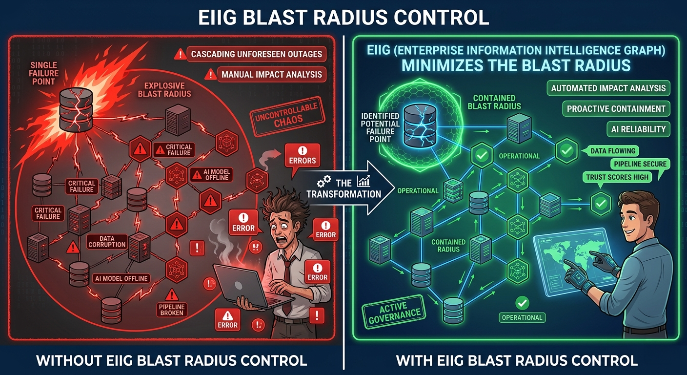
How Orion Governance’s EIIG Enables Blast Radius Calculation to Strengthen Data and AI Governance
In modern enterprises, data ecosystems have become deeply interconnected across cloud platforms, AI pipelines, analytics tools, legacy systems, and [...]
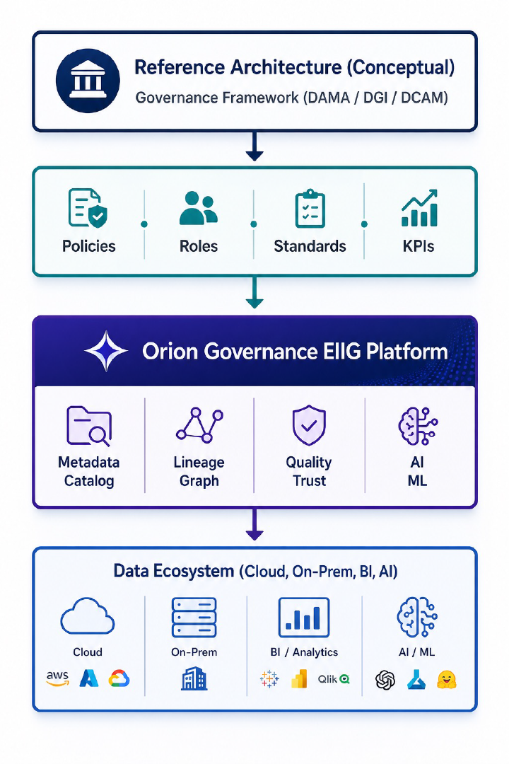
How to Leverage Orion Governance Enterprise Information Intelligence Graph to Implement Data Governance Framework
To use Orion Governance Enterprise Information Intelligence Graph (EIIG) effectively, you shouldn’t treat it as “just a tool.” It [...]
Orion Governance Enterprise Information Intelligence Graph Data Quality Baseline Report
A Data Quality (DQ) Baseline Report acts as the "health check" of your data before any remediation begins. In [...]

From Data Lineage to Enterprise Intelligence Fabric
Orion Governance’s Enterprise Information Intelligence Graph (EIIG) offers the definitive data lineage solution: automated, comprehensive, granular, multi-layered, and collaborative. [...]
The Benefits of Using Orion Enterprise Information Intelligence Graph to Accelerate Cloud Migration/ Modernization
Cloud migrations are often framed as a technical exercise — move systems, modernize platforms, decommission legacy tools. But the [...]
